
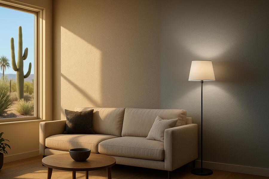
Choosing the perfect paint color for your interior spaces is often one of the most exciting, yet challenging, parts of a home renovation. You might fall in love with a swatch in a store, only to find it looks entirely different once it’s on your walls. This common dilemma isn’t due to a fault in the paint, but rather a fundamental principle of color perception: how lighting affects interior paint color. Color isn’t just pigment; it’s light reflecting off a surface into our eyes. Any change in the light source—whether natural or artificial—will dramatically alter how a specific hue appears. Understanding this interaction is key to making informed paint choices and avoiding costly mistakes.
As professional painters and color consultants, we routinely guide clients through this process, demonstrating how the same paint color can transform throughout the day or under different lighting conditions. It’s a nuanced interplay of physics and perception that can make or break a room’s aesthetic. Let’s shed some light on the various factors that influence how paint colors truly appear in your home.
Natural Light: The Ever-Changing Canvas
Natural light is arguably the most influential factor, and it’s constantly changing. Its quality and intensity vary dramatically throughout the day and year, as well as by the room’s orientation.
Direction of Natural Light and Its Impact
- North-Facing Rooms: Receive cool, indirect light throughout the day. Colors in these rooms will appear darker, cooler, and sometimes a bit muted. Blues and greens might intensify, while warmer colors might appear grayer or flatter. Warm white or yellow-toned paints can help counteract the coolness.
- South-Facing Rooms: Bathed in bright, warm light for most of the day. This abundant light makes colors appear brighter and more vibrant. Cooler colors can be balanced by the warmth, while warm colors can become quite intense. These rooms can handle deeper, richer tones without feeling too dark.
- East-Facing Rooms: Get strong, warm, yellowish light in the morning, which gradually fades to cooler, bluer light in the afternoon. Paint colors will appear warmer and brighter in the morning, then transition to more subdued tones later in the day.
- West-Facing Rooms: Experience soft, indirect light in the morning, followed by intense, warm, and often reddish-orange light in the late afternoon and evening. Colors will shift dramatically, appearing cooler earlier in the day and then much warmer and more saturated as the sun sets.
Time of Day and Season
Even within the same room, the angle and intensity of sunlight change hourly. A color that looks perfectly balanced at midday might appear completely different at dawn or dusk. Seasonal changes also play a role, with winter light often being cooler and weaker than summer light. This constant shift is why it’s crucial to observe paint samples at various times throughout the day before committing to a final color.
Experienced interior painters phoenix az understand these dynamics profoundly.
💡 Key Takeaway: Natural light significantly alters paint perception based on room orientation (North = cool/dark, South = bright/warm) and time of day, causing colors to shift in warmth, intensity, and hue.
Artificial Light: Your Controllable Variable
Unlike natural light, artificial lighting is a factor you can control. The type of light bulb you choose can have a profound impact on how your paint colors are perceived.
Color Temperature (Kelvin)
- Warm Light (2700K-3000K): Incandescent and many LED bulbs emit a warm, yellowish-orange light. This enhances reds, oranges, and yellows, making a room feel cozier and more inviting. However, it can make blues and greens appear duller or muted, and some cool grays might take on a yellowish cast.
- Cool Light (4000K-5000K): Fluorescent and some LED bulbs produce a cooler, bluer-white light, similar to daylight. This light brings out blues, greens, and true whites, making a space feel more energetic and modern. It can, however, make warm colors appear harsher or less vibrant, and can sometimes feel sterile if overused.
- Daylight/Neutral Light (3500K-4000K for neutral, 5000K-6500K for daylight): These bulbs aim to mimic natural daylight, offering a balanced spectrum that renders colors more accurately. They are often preferred for task lighting or in spaces where true color representation is important, like art studios or kitchens.
Color Rendering Index (CRI)
The CRI of a light bulb measures how accurately it renders colors compared to natural light (on a scale of 0-100). A high CRI (90+) will show paint colors closer to their true hue, while a low CRI can make colors look dull, distorted, or simply “off.” This is particularly important for discerning subtle differences in paint shades.
💡 Key Takeaway: Artificial light’s color temperature (Kelvin) and Color Rendering Index (CRI) are crucial. Warm light enhances reds/yellows, cool light enhances blues/greens, and high CRI bulbs render colors most accurately.
Other Factors Influencing Color Perception
Beyond the direct light source, several other elements in a room can subtly or overtly shift how a paint color is perceived.
Reflective Surfaces and Existing Colors
- Surrounding Objects: Large pieces of furniture, flooring, window treatments, and even landscaping visible through a window can reflect their own colors onto the walls, influencing how the paint appears. For example, a lush green lawn outside a window can cast a subtle green hue on interior walls.
- Adjacent Walls: If a room is painted with multiple colors, or if the paint color extends into an adjacent room, the neighboring hues can influence each other’s perception.
Sheen and Texture
- Paint Sheen: The sheen level of the paint (flat, eggshell, satin, semi-gloss, gloss) dramatically affects how light reflects off the surface. Higher sheens reflect more light, making colors appear brighter and sometimes more intense, while flat finishes absorb more light, often making colors look softer and richer.
- Wall Texture: Heavily textured walls (e.g., stucco, popcorn ceilings, or even subtle drywall imperfections) can create tiny shadows that make a color appear darker or more varied than it would on a perfectly smooth surface.
| Light Source Type | Characteristics | Effect on Paint Colors |
|---|---|---|
| North-Facing Natural Light | Cool, indirect, consistent. | Colors appear darker, cooler; blues/greens intensify; warm colors mute. |
| South-Facing Natural Light | Bright, warm, direct. | Colors appear brighter, warmer, more vibrant; can intensify warm hues. |
| Warm Artificial Light (2700K-3000K) | Yellowish-orange, cozy. | Enhances reds/oranges/yellows; mutes blues/greens; can add yellow cast to cool colors. |
| Cool Artificial Light (4000K-5000K) | Bluer-white, energetic. | Enhances blues/greens/whites; can make warm colors harsher or less vibrant. |
💡 Key Takeaway: Beyond light sources, existing room elements like furniture, flooring, and even landscaping, along with the paint’s sheen and wall texture, can subtly or significantly alter how a chosen paint color ultimately appears.
Understanding how lighting changes the way interior paint colors look is not just an academic exercise; it’s a practical necessity for any successful painting project. Never judge a paint color by a tiny swatch under a single light source. Instead, observe samples on your walls throughout the day, under both natural and artificial light, and consider the room’s orientation and surrounding elements. This meticulous approach ensures that the color you choose today will be the color you love for years to come, truly transforming your space into the vision you imagined.
Have questions about how lighting changes the way interior paint colors look? Reach out to our team today.
Frequently Asked Questions
What is the best way to test paint colors in my home?
The best method is to paint large swatches (at least 2’x2′) directly onto your walls in several areas of the room, including those with different lighting conditions. Alternatively, use large peel-and-stick paint samples. Observe these samples at various times of day, under different natural and artificial lighting, and in relation to your furniture and flooring. Live with them for a few days to get a true sense of how the color behaves.
Can I choose a paint color based solely on my furniture or fabrics?
While your existing furniture, artwork, and fabrics are crucial starting points for your color palette, you should never choose a paint color based solely on them without testing it on the wall. The light in your room will interact with the paint pigment differently than it does with the fabric dyes, potentially leading to an unexpected result. Always bring samples of your fabrics into the room and compare them against your paint swatches on the wall.
How does paint sheen affect color appearance?
Paint sheen has a significant impact. Flatter finishes (like matte or flat) absorb more light, making colors appear deeper, richer, and softer. Higher sheens (like satin, semi-gloss, or gloss) reflect more light, making colors appear brighter, often slightly lighter, and more vibrant. The increased reflectivity can also highlight wall imperfections, whereas flatter sheens tend to conceal them.
What if my chosen paint color looks different after it dries?
It’s common for paint colors to appear slightly different when wet versus when dry. Wet paint can look darker or have a different undertone. Always allow paint samples to dry completely before making a final judgment. If the dry color is significantly different or undesirable, it might be due to the interaction with your room’s unique lighting conditions. Re-evaluate your choice, perhaps testing a slightly lighter or warmer/cooler variation of the original color.
